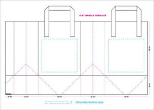
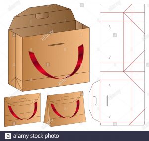
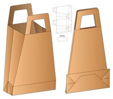
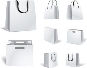
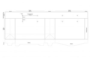
We have an exclusive design tool which makes it very easy to create your own custom gift bags and shopping bags. Huge selection of twisted handle gift paper bags and shopping bags can be designed online. You can make custom printed gift paper bags in a fraction of the time it takes to get a salesman to call. Just design your custom printed paper bag here.

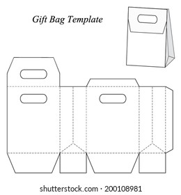
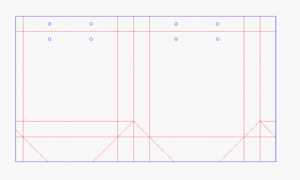
Design tips for paper bags
• Keep your design simple – too many elements can be overwhelming.
• Make your logo big and bold for instant recognition.
• Darker colors look sharper on both paper options, avoid light colors on brown kraft.
• Single-color designs that cover the entire print area may result in slight blemishes.
• Note: white ink is not available for printing.
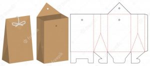
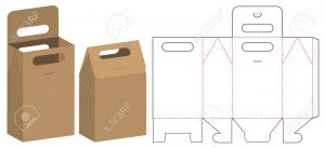

Keep your design simple introduce.
When you ask someone why they love their Apple iPhone or Apple MacBook, you usually get the answer similar to this: “Because it’s simple!”. When you probe further, most fans and users of the product can’t really explain how and why it’s simple. To them, “It just works.” as Steve Jobs would say. Simplicity is not easy to define or measure. Joe Sparano, an American graphic designer and design educator says it best: “Good design is obvious. Great design is transparent.”
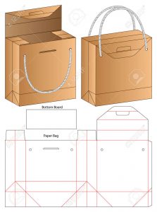
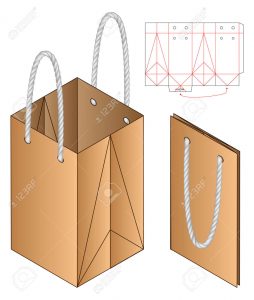
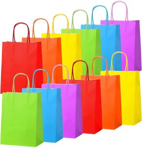
Make your logo big and bold for instant recognition introduce.
Your logo will have a huge impact on the first impression your business is going to make: It will give your customers information about your brand and let them know if it’s right for them.Because your logo is such an essential part of your brand, you want to make sure it’s done well. All your branding materials will have your logo on them. It’ll stare back at your customers from your website, your packaging, and your business cards.
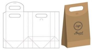
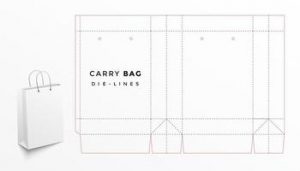
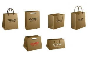
Darker colors look sharper on both paper options, avoid light colors on brown kraft.
Colors can have a ton of different meanings. The psychology behind color is complex, but to keep it short, colors have certain emotions and ideas attached to them. To learn more about color theory be sure to check out this in-depth guide on logo colors and their meanings.Of course you don’t need to stick with a monochrome logo using just one color, but you can combine several logos colors to tell a complete brand color story. To choose colors that work well together, take a look at the color wheel.
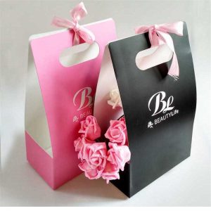
Single-color designs that cover the entire print area may result in slight blemishes.
Red: Red stands for excitement, passion and anger. It’s a great choice if your brand is loud, youthful and wants to stand out.
Orange: Orange is much less used than red but it’s just as energetic. This is a vibrant, invigorating and playful color.
Yellow: If you want to look accessible and friendly, yellow is the right choice. It gives off a cheerful, affordable and youthful energy.

Note: white ink is not available for printing.
You want your logo to look clean, modern and minimalistic? Use lots of white in your logo. As a neutral color it works in combination with all other colors, but adds a clean, youthful and economical touch.
